Voeg in enkele minuten lidmaatschappen toe aan uw Webflow-project.
Meer dan 200 gratis kloonbare Webflow componenten. Aanmelden is niet nodig.
Voeg in enkele minuten lidmaatschappen toe aan uw React-project.
This is part three of a series where I build a Productized Service agency using Memberstack and Webflow. You can check out part two here and part one here. In this blog, I’ll give youupdates on what services I plan to offer, share the name of the company, and explain how I customized the template to fit my brand and requirements. Enjoy!

Project Updates
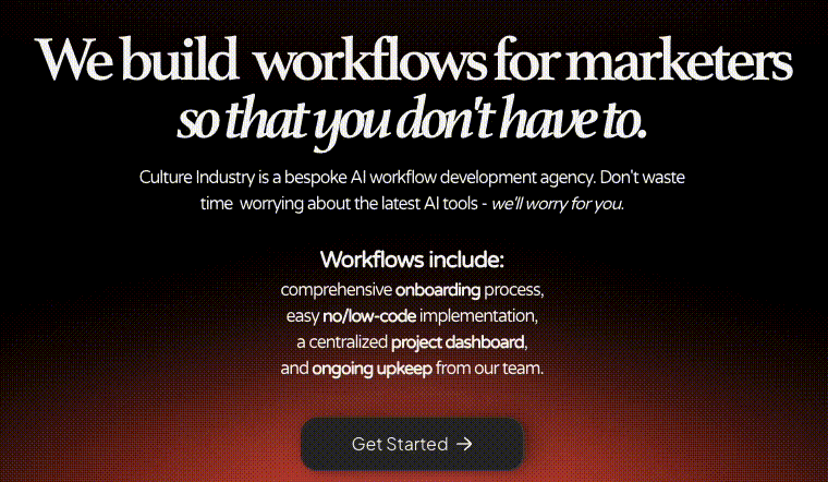
In the last blog, I mentioned that I was planning on pivoting into more AI-focused development services. The design process forced a certain refinement of those ideas – and so over the last couple of days of finalizing the design and brand, I have settled on a more specific and approachable plan of action.
Narrowing Focus
The idea occurred to me when I was mapping out the site for the redesign (a process I’ll go into below). I was trying to write compelling copy and found it difficult to imagine these service offerings. How was I supposed to know what to build?
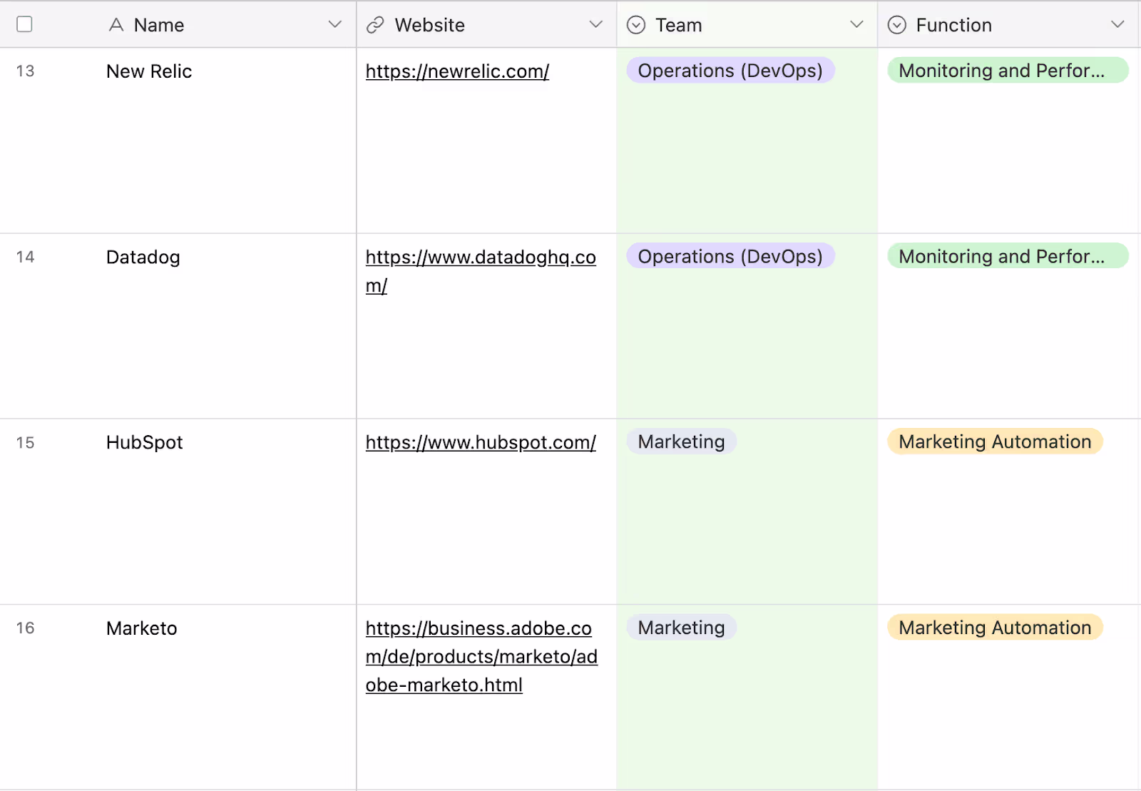
To solve this, I chatted with Google Gemini about the most popular software stacks for different functions within companies. My goal was to meet potential clients where they already were. I asked it to describe what marketers and DevOps teams (to name a few) actually do – their software, key terms, pain points. I then used this to create a table in Airtable of about 90 of the most popular tools across these team categories.
I used Gemini because I find it better for these kinds of factual, “give me a list of X” questions (it seems less prone to hallucinations).
I am fairly proficient in Make.com so I decided that Make.com development-as-a-service would be an easy place for me to start. Again, my goal is to find the shortest path to a functional business.
I created a Make.com scenario that took the HTML code from the Make.com Integrations page and ran a regex in a Match Pattern (Advanced) Text parser module to generate a list in Airtable of every company that is natively integrate-able with Make. I asked ChatGPT to write the regex (it’s pretty complicated).

Finally, I asked ChatGPT (which I find to be better for code generation) to write a Python script that output the common items between my Gemini-generated list of popular software and the list of Make.com integrate-able software. This created a list of about 40 popular, team-specific workflow generation targets I could build entirely in Make.com. I plan to offer workflows that incorporate AI APIs (like the OpenAI module’s Chat Completion function) in unique and interesting ways.
And with that breakthrough, I had a narrow enough target to begin designing the rest of my site!
Designing My Productized Service Site
We left off the last blog with the skeleton of a functional site. I hadn’t confirmed the name or design principles of my agency, nor had I come up with a clear mission for what I wanted to do with the company. This would be my next goal.
Branding
Initially, my thought was to create an entire brand guideline outlining the colors, shapes, tone, and words that I’d try to include in my side. Very quickly, I realized that this was not necessary at all and would take way too much time. I want this site to be up and running yesterday.
With that in mind, I took about an hour and a half to go through some of my favorite design inspo sites (like Dribbble and Awwwards), as well as some Pinterest boards to try and get some high-level inspiration around things like colors and structure. My plan was to keep the structure more or less identical to what it already was – while still making it uniquely my own. I use Arc for my browser and the easel feature made this so much easier.
About a year ago, I purchased the URL culturyindustry.ai (I have a tendency to arbitrarily buy URLs that I think are funny). I used to read a lot of philosophy and thought that a .ai website about the culture industry would be hilarious and ironic.
However, I think the name is pretty cool and eye-catching and I already own the URL (.ai TLDs are getting expensive). Therefore, I decided to use it and call the company Culture Industry.
I used Adobe Illustrator (which I pay $31 a month as part of my Creative Cloud subscription) to draw a simple logo. I tried to pair the image of a factory (industry) with a winking face (culture).

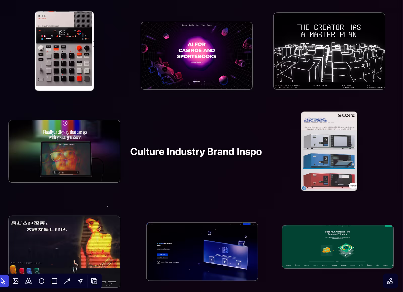
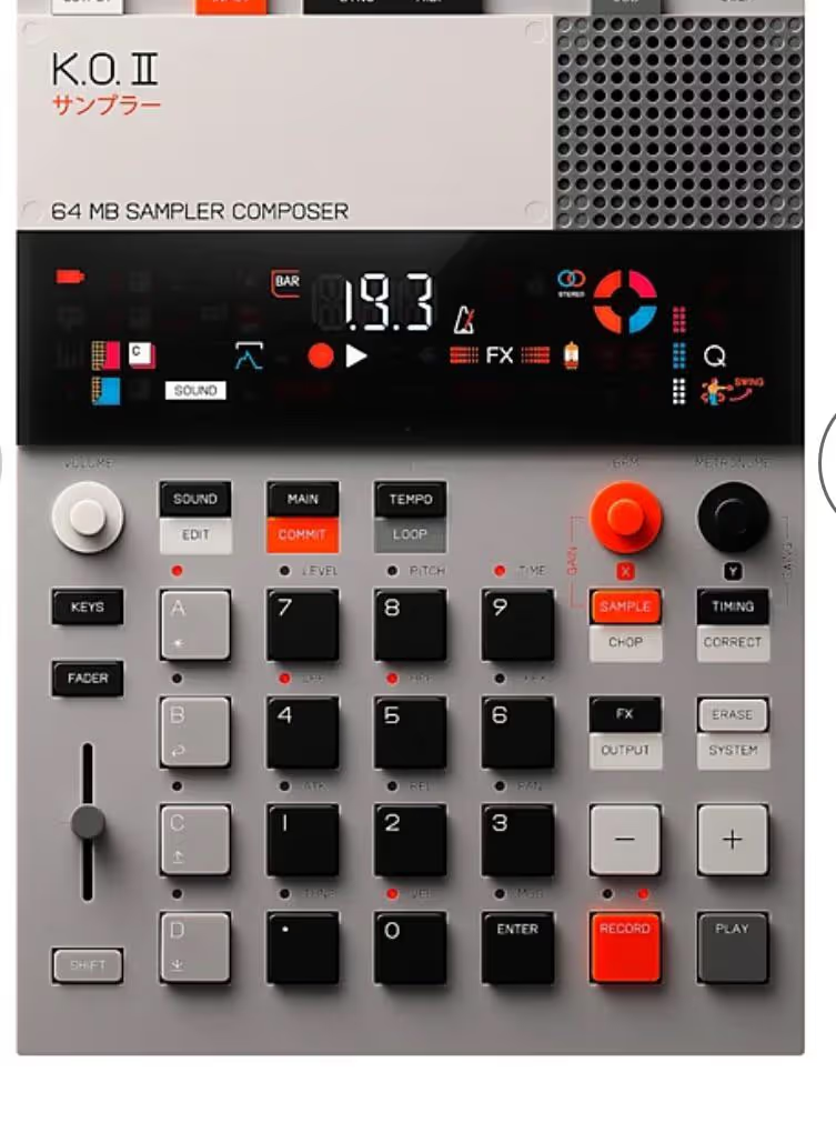
Lastly, I found this picture of a synthesizer that looked cool. The Teenage Engineering style is in right now, and I think it captures the idea of culture + industry well. Instead of spending any time designing a color scheme, I just copied its colors and called it a day.
And with that, I felt done with the branding and design process.
Homepage Copy
A notable thing about the Productized Service template is the completeness of the fictional company it depicts. There is almost no lorem ipsum on the site. Everything is what a Webflow Development Agency would plausibly say on their site. This meant that I would need to go through and change everything by hand.
I found that the easiest way to do this was to go through the site and break the template down in a Notion document. That would let me know the kinds of choices I’d need to start making when it came to homepage copy. That breakdown looked like this:
The notes are my own – I don’t have testimonials, customers, or awards yet so I knew immediately that I’d probably want to delete those. I asked ChatGPT to generate some samples, which helped me find the right tone and style, although, in the end, I did end up writing my own copy.
This step happened alongside my epiphany about focusing on Make.com AI integrations (as explained in the last section). This is maybe the best reason to use this template – the existing site is an extremely well-designed version of a Productized Service company. Trying to fit my own agency into that mold was the most constructive business development activity I could have done. SaaS that creates your entire site for you robs you of this process.
Design
Once I had settled on the branding of my site, my goal for the homepage re-design was to just go through and replace everything with the colors that I had settled on. Of course, it ended up being a bit more involved than that.
The biggest piece of advice I’d have for someone looking to make substantial changes to the site assets and design (like myself) would be:
- Buy Adobe Illustrator and Photoshop (or something to that effect)
- Go through each visual element on the site to understand what’s going on.
To give an example, the hazy blue blobs behind many of the images or text boxes are actual PNG images (and not native Webflow elements that can be changed in the Designer). To make them orange I had to find each image, download them onto my computer, put them into Photoshop, and color-replace blue pixels with orange ones. There are a bunch of tutorials on YouTube that explain how to do this if you don’t already know.
The biggest challenge was probably getting the headliner image to match my color scheme. The one in the template was bright blue and (as I’ll explain in the next section) showed a dashboard that did not look like my own. To overcome this, I had to recreate the template in orange, by hand, in Illustrator. I added some extra popups and tried to make it match what I planned to do. Once again, this was a very helpful exercise because it forced me to consider how everything would eventually work/look.
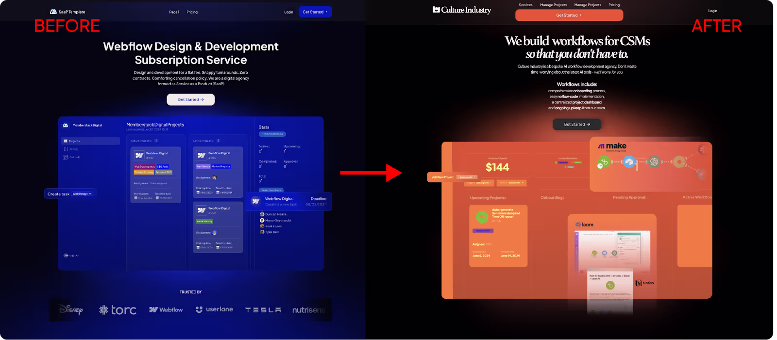
Lastly, I added a custom script I found online that cycles the title through the different verticals I hope to design for (marketers, sales teams, DevOps teams, etc.). It was very easy to set up – I just had to assign a span on the word an element ID and put the code before the </body> tag. I think it turned out great.
Dashboard
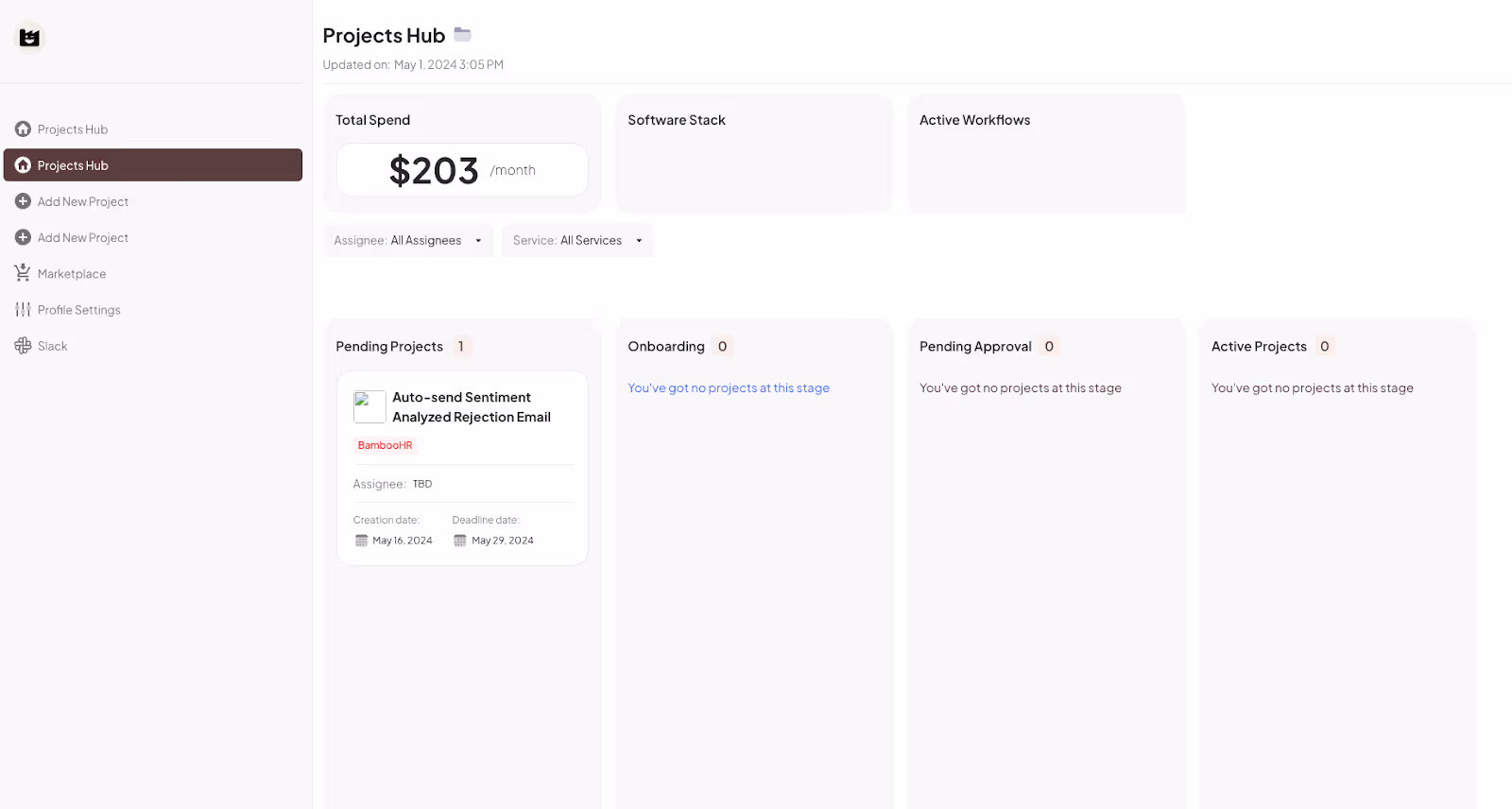
Maybe the biggest deviation from the template came from the dashboard. I knew that I didn’t want an open-ended “projects” category. After deciding on the software-specific service offerings, I redesigned it to reflect this. Truthfully, I didn’t change how anything looked (except the colors and icons). The “Add Project” feature will work differently though.
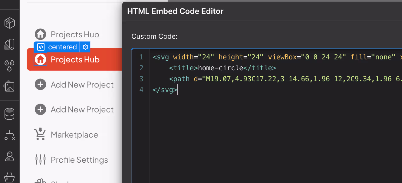
I also added a Marketplace tab on the sidebar. To note: the icons in the sidebar tabs are not images. They are SVG code inserted via HTML embeds. A quick Google search explained how they worked, so it wasn’t an issue. I’ll explain the marketplace in more detail in a later blog, but I think I’ve settled on using Memberstack’s JSON features to associate different tools with specific users. We’ll see if that works when I get there.
Lastly, I added a “Total AI Spend” box to the dashboard (alongside new “Software Stack” and “Active Workflows” ones). I think this is a cool feature that shouldn’t be too hard to set up. I think it sets the tone for what I hope the platform will eventually become (wink, wink).
Volgende stappen
You’ll notice that I did not mention the pricing page. That’s going to be the focus of my next blog. I need to map out exactly what I plan to offer, how the subscriptions will work, and how it’ll be integrated with the dashboard/accounts.
My goal is to get to the marketing stage by next week at the latest. At this point, I’d be fine sending out a semi-functional website (where clients can at least add and view projects) over spending any more time trying to optimize the look or functionality of the site. I am certain that the most important realizations will only come once I start talking to clients.
Conclusie
An update on costs:
Total Cost:
Webflow CMS Site Plan: $29
Memberstack Basic Subscription: $29
Make.com Basic Subscription: $9
Productized Service Template: $56
Adobe Creative Suite: $31
TOTAL: $154.00
Total Revenue:
TOTAL: $0
I’m starting to see the finish line (or, at least, the next starting line). Creating a business is such an interesting process – it starts to take on a life of its own as problems and solutions reveal themselves. I can only imagine what’ll happen once we start getting client feedback in the mix. I hope you’ll stick around for part four!

.webp)


.png)