Robert Jett
How to Prevent Body from Scrolling when a Menu Or Modal is Open in Webflow
Web design is not just about aesthetics; it's also about providing a smooth and intuitive user experience. One of the frequent challenges web designers face is how to maintain focus on a particular element, like a navigation menu or modal, without allowing the visitor to scroll away. This issue has been particularly discussed in Webflow's community forums but the solutions can sometimes be a bit scattered and confusing.

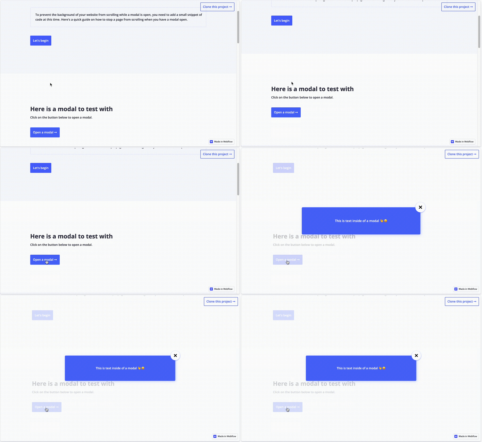
(To find this template, click here.)
In this blog post, we will streamline all that information and provide you with step-by-step guidance on how to prevent body scrolling when a menu or modal is open, specifically in Webflow. Thank you to this forum post and this forum post for providing some of the background used in this post.
Using jQuery to Lock Scrolling on Menu Open
The Basic Script
Webflow provides a powerful platform to build visually compelling websites without needing to be an expert in coding. However, for specific custom behaviors like this, a bit of custom code can be quite useful. The script modifies the overflow property (which provides the ability to scroll) of the webpage’s body tag to hidden when the menu is open and changes it back to auto when the menu is closed:
To briefly explain what this code does:
Webflow.push(function() { ... }): This line wraps the code inside a function that gets executed after Webflow's own JavaScript has been initialized. It's a way to ensure that your custom JavaScript runs at the right time.
$('.menu-button-class').click(function(e) { ... }): This line listens for a click event on any HTML element with the class menu-button-class. When such an element is clicked:
e.preventDefault(): This prevents the default action associated with the click event, which could be navigating to a different URL or reloading the page.
$('body').css('overflow', 'hidden'): This sets the CSS overflow property of the <body> element to hidden. This has the effect of disabling scrolling on the webpage.
$('.menu-class-name').click(function(e) { ... }): This line listens for a click event on any HTML element with the class menu-class-name. When such an element is clicked:
$('body').css('overflow', 'auto'): This sets the CSS overflow property of the <body> element back to auto, which allows the webpage to be scrollable again.
In summary, the code toggles the scrolling ability of the webpage when certain elements are clicked. When an element with the class menu-button-class is clicked, scrolling is disabled. When an element with the class menu-class-name is clicked, scrolling is re-enabled. This can be useful for focusing user attention on a navigation menu when it's open and avoiding distractions.
Therefore, it is important to replace .menu-button-class and .menu-class-name with the class names that you've assigned to your menu button and menu, respectively. Once you've done this, add the script to your custom code section in Webflow, and your body should no longer scroll when the menu is open.
Problemen oplossen
Modifying HTML
In some browsers or scenarios, simply setting the overflow property on the body might not be sufficient to disable scrolling. This is because the browser may interpret the html element as the root scrolling container, not the body.
Therefore, a modification to the code can be made that will apply the changes not only to the body, but to the HTML itself through the following modification:
$('body, html').css('overflow', 'hidden');
By setting the overflow property to "hidden" for both the html and body elements, you cover all your bases, making it more likely that the scroll-locking will work consistently across all browsers and situations.
Overcoming iOS Limitations
It's important to note that the basic script mentioned above may not work perfectly for iOS devices due to an older bug. A workaround for this involves detecting the operating system of the device and implementing a different approach if it's an iOS device.
You can find a discussion on this code in this forum post.
Conclusie
Both methods have their advantages and disadvantages. Custom JavaScript/jQuery code offers more control but can be more complex to implement. Webflow Interactions, on the other hand, are easier to use but might not cover some specific use-cases. Choose the one that fits your project’s needs best.
Remember, the key to a good user experience is not just what users see, but also how they interact with your site. Therefore, ensuring that menus and modals function seamlessly is critical for maintaining engagement and improving the overall usability of your website.
Voeg in enkele minuten lidmaatschappen toe aan uw Webflow-project.
Meer dan 200 gratis kloonbare Webflow componenten. Aanmelden is niet nodig.
Voeg in enkele minuten lidmaatschappen toe aan uw React-project.

.webp)


.png)
