
Robert Jett
How to Create A Modal/Popup In Webflow
If you've ever visited a website and seen a pop-up window that appears over the main content—perhaps a sign-up form, a notification, or a product detail—that's a modal. Far from being just aesthetically pleasing, modals are highly functional elements that serve a multitude of purposes. They can help in gathering user input through forms, displaying important information, or guiding user actions—all without navigating away from the current page.
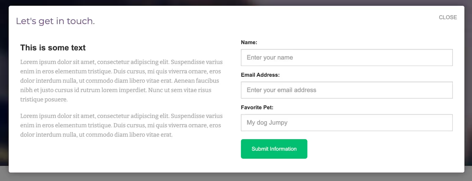
While you might assume that implementing these features would be complex, the reality is that Webflow provides a straightforward way to integrate modals into your website. This blog post aims to walk you through that process, step by step.
How to Create a Modal in Webflow
So how do you create a basic modal in Webflow? Here is a step by step guide (thank you to Sergei Magdalin for providing a walkthrough for this here).
Part 1: Creating the Modal Element
Before we get into animating and making our modal interactive, we first need to design its basic structure. Here, we'll be focusing on creating the modal background and window, and placing the essential elements like buttons and text within it. So let's break it down step by step.
Step 1: Design a Modal Background
Create a Section: Within the body of your Webflow project, create a new section and assign it the class name “modal background”.
Styling: Give this section a transparent black background. To make sure the modal stays in place while scrolling, set its position to 'fixed' and increase the z-index.
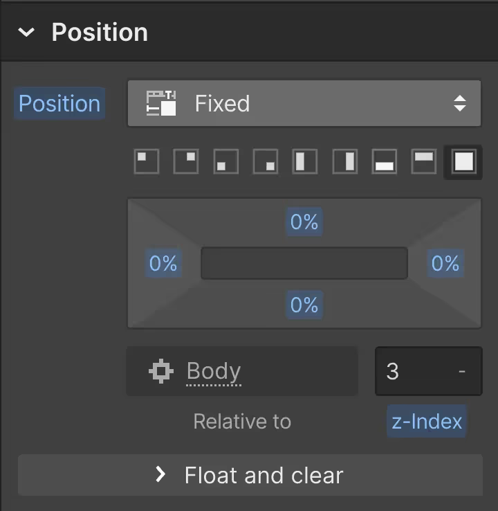
Note: This is just one way of making the modal fixed; you can opt for different CSS styles for different behavior.
Step 2: Add a Modal Window
Create a Block: Inside your "modal background" section, add a new block element (div) and name it “modal window”.
Center the Block: To center this block on the page, set the margins on the left and right to "auto" and give it a width of 70%.
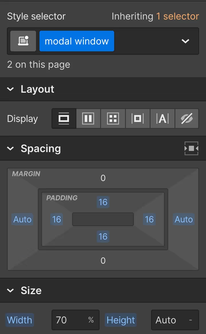
Note: Other methods to center the block could include setting a percentage-based left and right margin or using absolute positioning within the modal background.
Step 3: Add Content Inside Modal Window
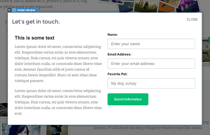
Content: Inside the “modal window” block, you can drop any structure and content you want—this could be text, images, forms, etc.
Step 4: Add a Close Button
Close Button: Add a link block containing either an 'X' icon or a “Close” text link within the top right corner of the “modal window”.
Styling: Assign this link block the class “close modal” and style it as you wish.
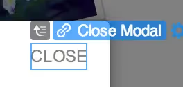
Step 5: Set Display to None
Visibility: Go back to the "modal background" section you initially created and set its display property to 'None'. This ensures that the modal won't appear until triggered.


Step 6: Create a Trigger Button
Trigger Button: Create a button anywhere on the page and assign it the class “modal link”.
Part 2: Adding the Code for Interactivity
Now that we have the visual elements in place, it's time to breathe life into our modal by making it interactive. Don't worry if you're not a coding expert—this step is straightforward and I'll guide you through each line of code.
Step 1: Access the Code Section in Webflow
Navigate to Site Settings: Go to your Webflow dashboard and find your site’s settings.
Code Injection: Scroll down to the Custom Code section and look for the "Before </body> tag" input field. This is where we'll be placing our JavaScript code.
Step 2: Insert the Code
Copy and paste the following code into the "Before </body> tag" field:
Understanding the Code
Let's break down what this code is doing in a way that's easy to understand:
Document Ready: $(document).ready(function() {...}); - This line ensures that the code inside it will only run after the webpage is fully loaded.
Modal Link: $('.modal-link').click(function() {...}); - This part says: "When someone clicks the button with the class 'modal-link', do the following action."
Fade In: $('.modal-background').fadeIn(); - When the button is clicked, the modal background will "fade in," making it visible.
Close Modal: $('.close-modal').click(function() {...}); - This part says: "When someone clicks the element with the class 'close modal', do the following action."
Fade Out: $('.modal-background').fadeOut(); - When the close button is clicked, the modal background will "fade out," making it disappear.
This small piece of code allows your modal to open when someone clicks the "modal link" button and close when the "close modal" button is clicked.
IMPORTANT NOTE:
The modal won't work in Webflow's preview mode since custom code is executed only after publishing. You can publish it to a subdomain to test its functionality.
Troubleshooting and Tips
You've got your modal up and running—great! But as with all things web development, you might run into some unique scenarios or challenges. Let's address some common questions, tips, and special needs to make sure your modal is not just functional, but also flexible and user-friendly.
Mobile Responsiveness
Modal Width: If you find that the "modal window" appears too squeezed on mobile devices, you can adjust its width specifically for smaller screens using Webflow's responsive design settings.
Modal Background: On mobile devices, you may want to set the modal background to 'Absolute' instead of 'Fixed' to allow users to scroll through the content. One caveat is that the background may not cover 100% of the device's height, but this can be adjusted with additional styling.
Editing the Modal
Visibility for Editing: To edit your modal, navigate to it in your Webflow project and change its display setting from 'None' to 'Block'. This allows you to see and edit the modal. Remember to set it back to 'Display: None' when you're done.
Styling and Animation Tweaks
OS X-style Popups: If you prefer a slide-down effect rather than a fade-in/fade-out, you can replace .fadeIn(); and .fadeOut(); with .slideDown(); and .slideUp(); in your jQuery code.
Special Use-Cases
Auto-Open Modal: To have the modal open as soon as the page loads, use the following jQuery code:
This code automatically shows the modal (using the .fadeIn(); function) as soon as the webpage fully loads ($(document).ready()). The modal will fade out when a user clicks on the element with the class close-button-class-here.
Close When Clicking Outside: To close the modal when clicking anywhere outside of it, you can add the following line in your jQuery:
This code will close the modal if the user clicks anywhere on the body of the page ($('body').click()).
Conditional Modal Opening: To create a link that opens the modal, while keeping it closed by default for other visitors, you can use:
This code adds a conditional check (if (location.hash == '#show-modal')) to see if the URL includes a specific hash (#show-modal). If it does, the modal will automatically appear when the page loads. You will then need to append the #show-modal hash to the end of the URL in in question (i.e. your-url.com/#show-modal).
Feel free to use these tips to tailor your modal to fit your specific needs and scenarios. Cheers!
Conclusie
Modals are a versatile web design element that can significantly enhance the user experience on your site. Whether it's for capturing emails, displaying additional information, or confirming user actions, modals serve a multitude of purposes. Creating modals in Webflow is not an overly complex task, and with a bit of fine-tuning and attention to details like mobile responsiveness and interactivity, you can design a modal that perfectly suits your needs.
Voeg in enkele minuten lidmaatschappen toe aan uw Webflow-project.
Meer dan 200 gratis kloonbare Webflow componenten. Aanmelden is niet nodig.
Voeg in enkele minuten lidmaatschappen toe aan uw React-project.

.webp)


.png)
